Flowhaven has a new look
You may have noticed things are looking a little different around the Flowhaven-sphere.
Evolution is in the DNA of licensing. The best teams are always looking forward–for the next big collaboration, the future of a product, and a new way to take their brand to the next level.
Change is in our DNA, too. We’re always thinking about how to push the industry forward with solutions that are as future-focused as our favorite brands are. Flowhaven has grown a lot since our humble beginnings in 2016—and with nearly 100 employees across five global offices, it was time for another big change: our look.
We’re thrilled to introduce you to the new Flowhaven. It’s bold, it’s unique, and it represents our history as much as it represents our future. With our brilliant friends at the Koto design agency, we’ve created a brand that we’re excited to start rolling out across our website and channels over the coming months (you can’t blame us for not wanting to hold on to the secret any longer). Here’s a look at how it all came together.
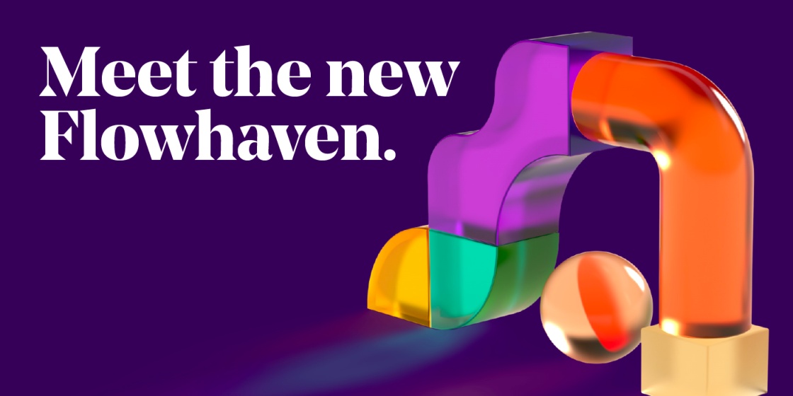
Let’s go bold
Our logo has served us well over the years, but we couldn’t shake the feeling that we could go bigger and bolder–not unlike our own growth journey these last few years. Our new logo has weight and presence, echoing the curves of our new design elements (more info on that below). Simple to understand but impossible to ignore. Sound familiar?

The shape of licensing
The distinctive shapes of the new brand speak to the many aspects of the licensing process—the licensors, the licensees, the products, the experiences, and so on. On their own, they’re eye-catching and special. But when they join forces? That’s when they create something extraordinary and unforgettable. We’re committed to help our customers build new licensing worlds, shedding light on the process so they can be their best and brightest selves.

Tech, but make it approachable
Spend any time in the tech industry and you’ll notice that the color palettes tend to have a certain starkness to them: bright whites against primary colors. We’ve flipped the script, opting for a warmer palette (still led by our iconic purple), that feels a little cozier and more welcoming. Your deals deserve a safe space to reside, and that’s exactly what Flowhaven provides.

A Finnish twist
We’ve got our sights set on the world, but we never forget our Nordic roots and values. That’s why our hero typeface is a nod to our heritage, a beautiful sans-serif designed by Finnish type foundry Schick Toikka. As described by its creators, “Noe speaks with clarity and confidence, but the point isn’t simply to shout. Its strong will is tempered by a graceful discipline. This is a distinguished type with sparkle and bite.” Now that’s a font we can get behind.
A lot has changed, but here’s what hasn’t: we’re as committed as ever to the industry we love and the people who make it extraordinary. We’re excited for this new phase of Flowhaven because we believe strongly that this evolution is not just for us.
Change is crucial to giving our customers the best—and we’ll never settle for sitting still.
Ready to feel the difference of Flowhaven for your program?
See how Flowhaven fits your workflows, priorities, and team structure in a personalized walkthrough.
This is not a hard sales call. No 12 page presentation. No lectures, no tactics. We want to understand your situation, and then maybe show you how Flowhaven can make your life easier.


